SEASONAL INTEGRATED CAMPAIGN

Survival Guide

Summer is peak season for pet adventure, and with it, unexpected risks. Our goal was to help dog owners enjoy the season while staying safe, with an emotionally resonant campaign that made pet insurance feel like empowerment, not paperwork.
The Summer Safety campaign for AKC Pet Insurance combined breed-specific insights with playful creative to drive quotes, build trust, and deliver a seasonal moment that felt both useful and heartfelt.
Role:
Art Direction
Concept Development
Design

insight
Generic advice does not resonate with devoted dog owners. With 58% traveling with their pets in summer, breed-specific safety tips created a chance to connect in a way that felt personal and authentic.

approach
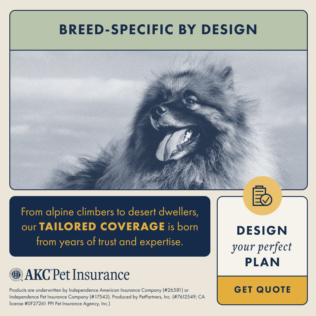
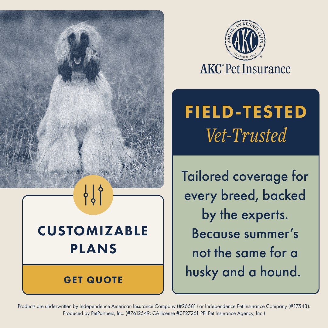
We reframed pet insurance as a trusted guide for every adventure. By tapping into breed-specific behaviors and risks, we created materials that felt tailor-made, positioning AKC Pet Insurance as both practical and deeply attuned to pet families.

result
The campaign celebrated breed pride, strengthened emotional connection, and framed being prepared as an essential part of loving and responsible pet care.
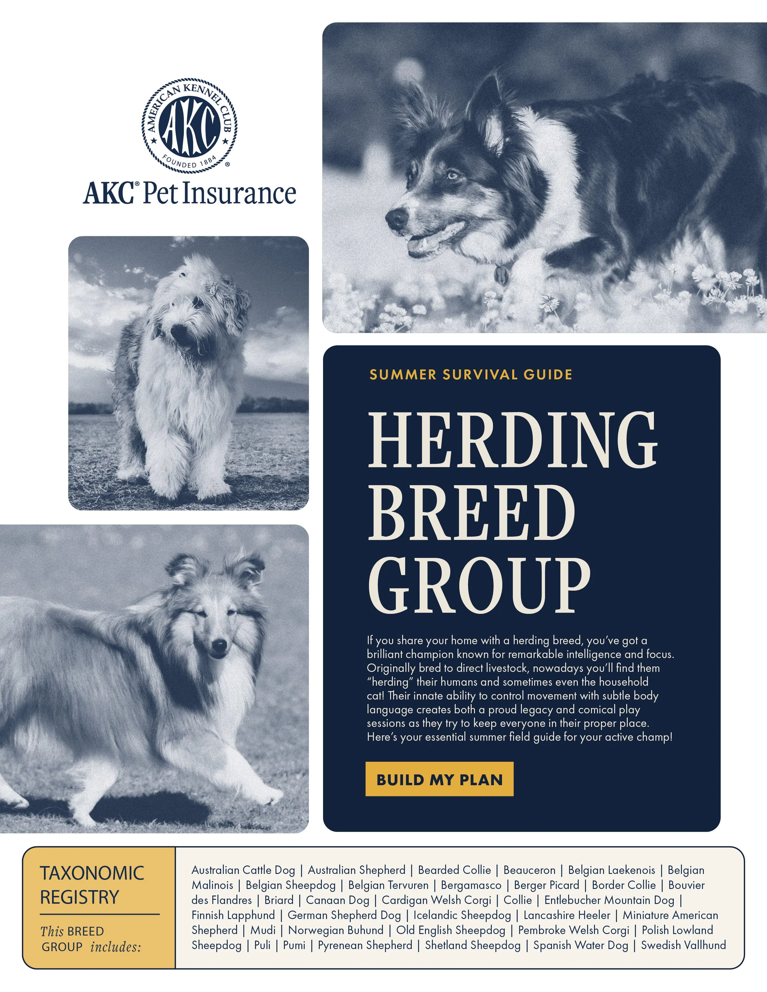
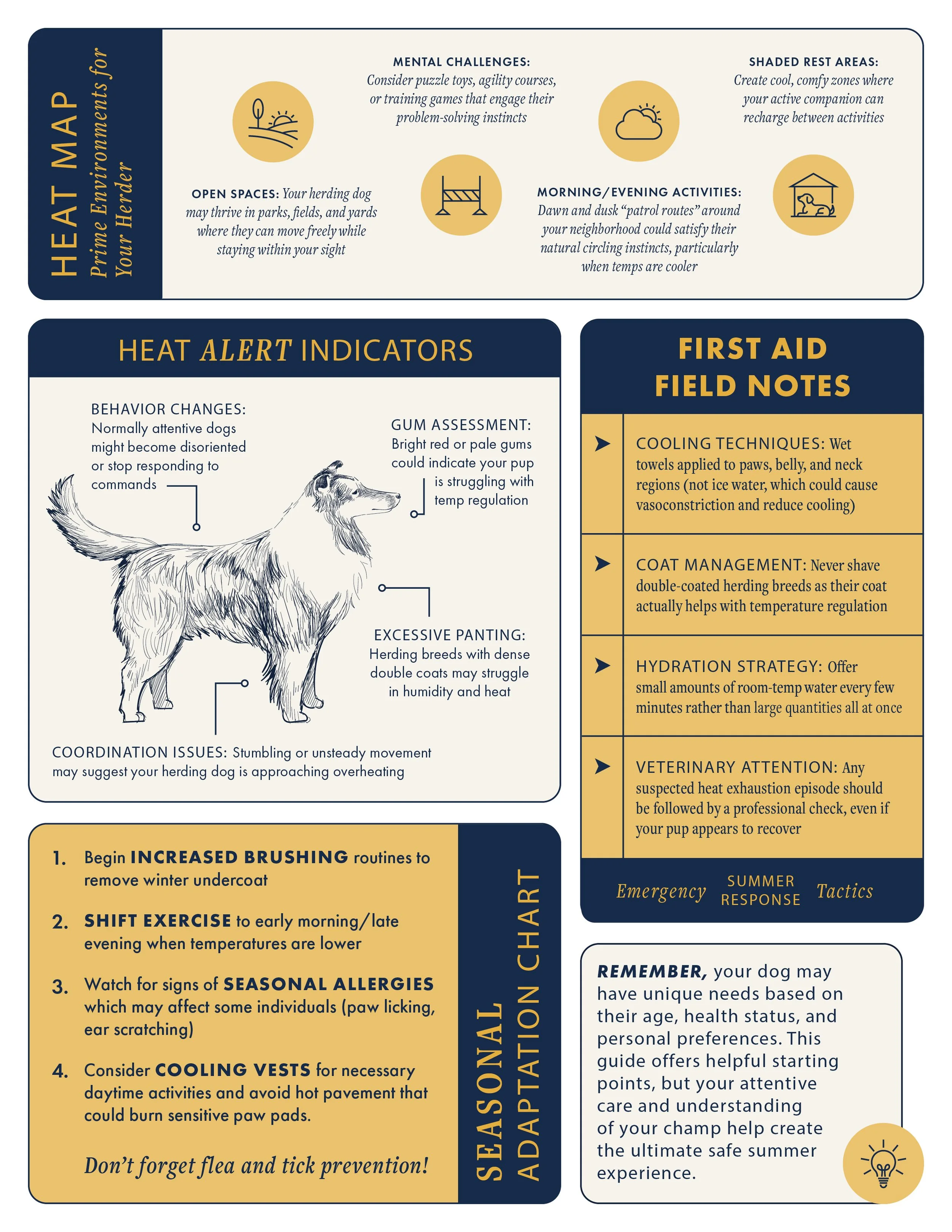
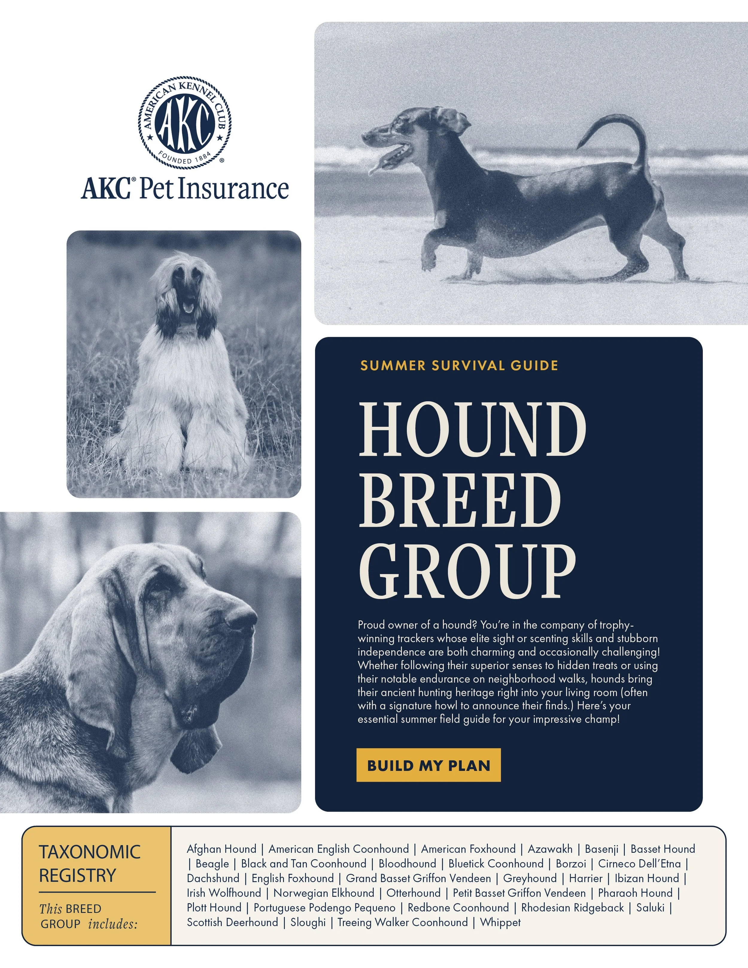
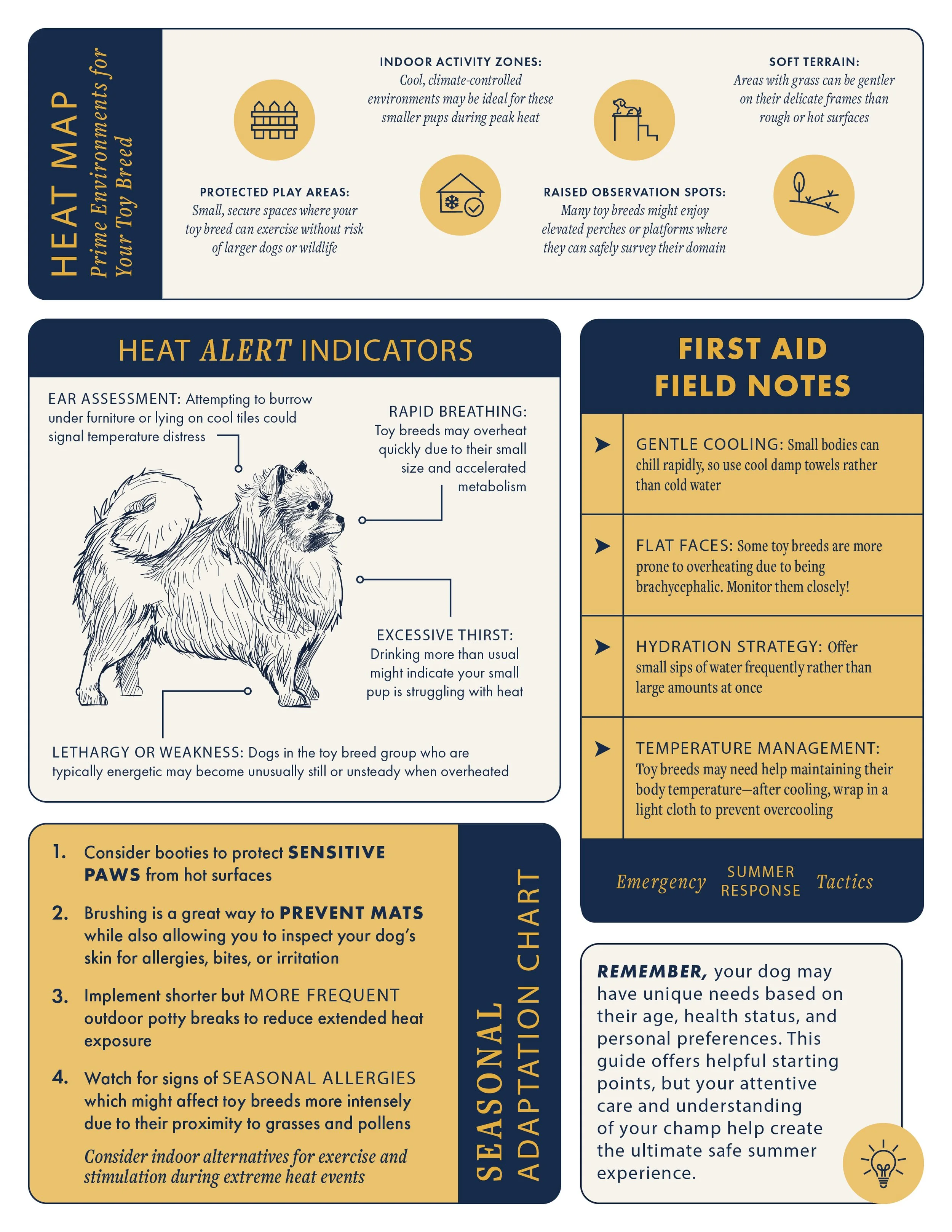
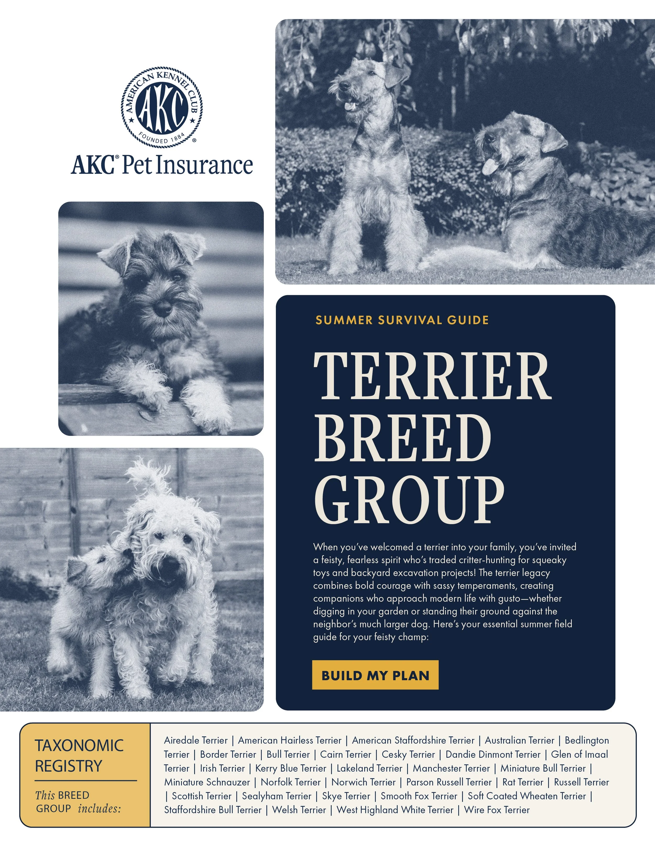
Turning Insights into Storytelling
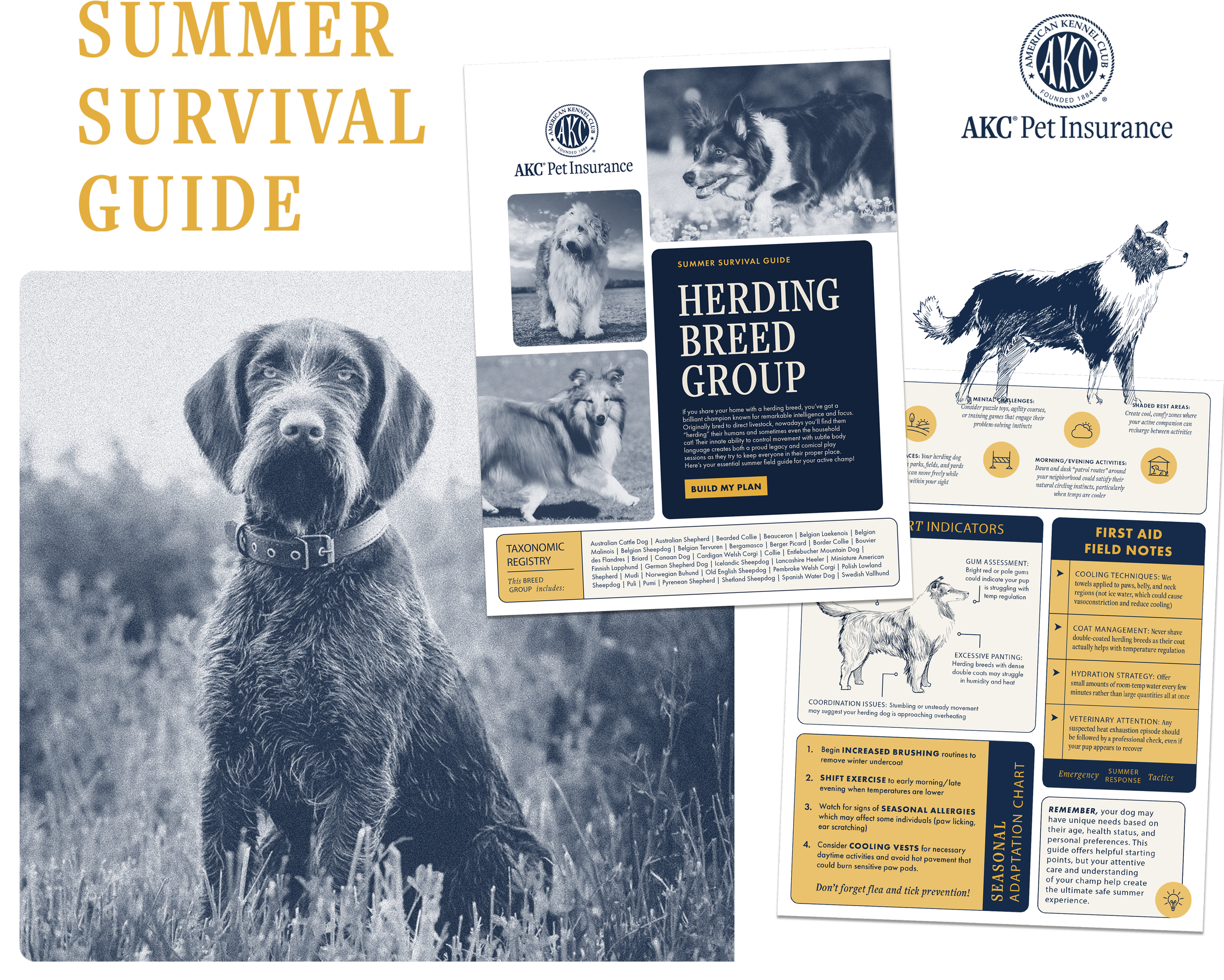
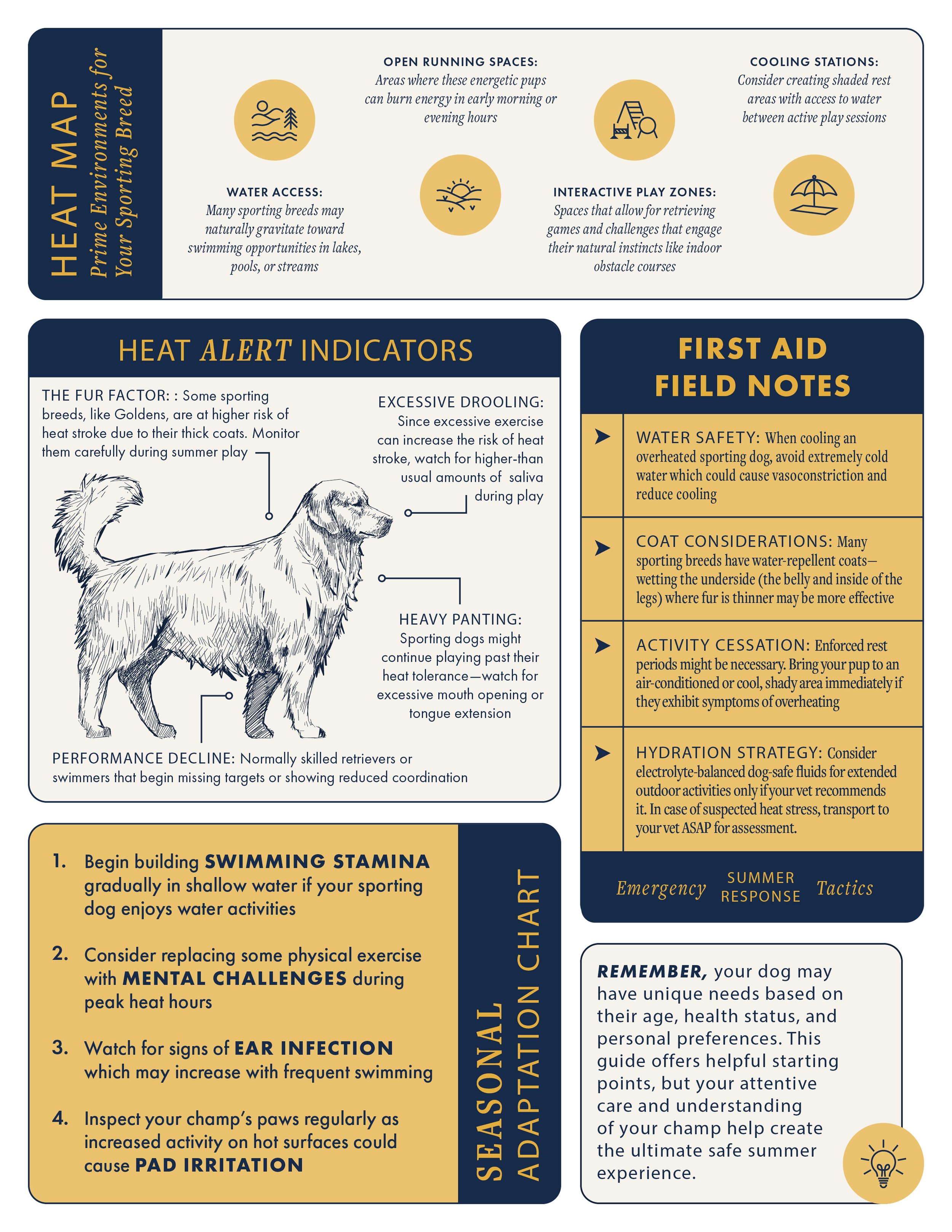
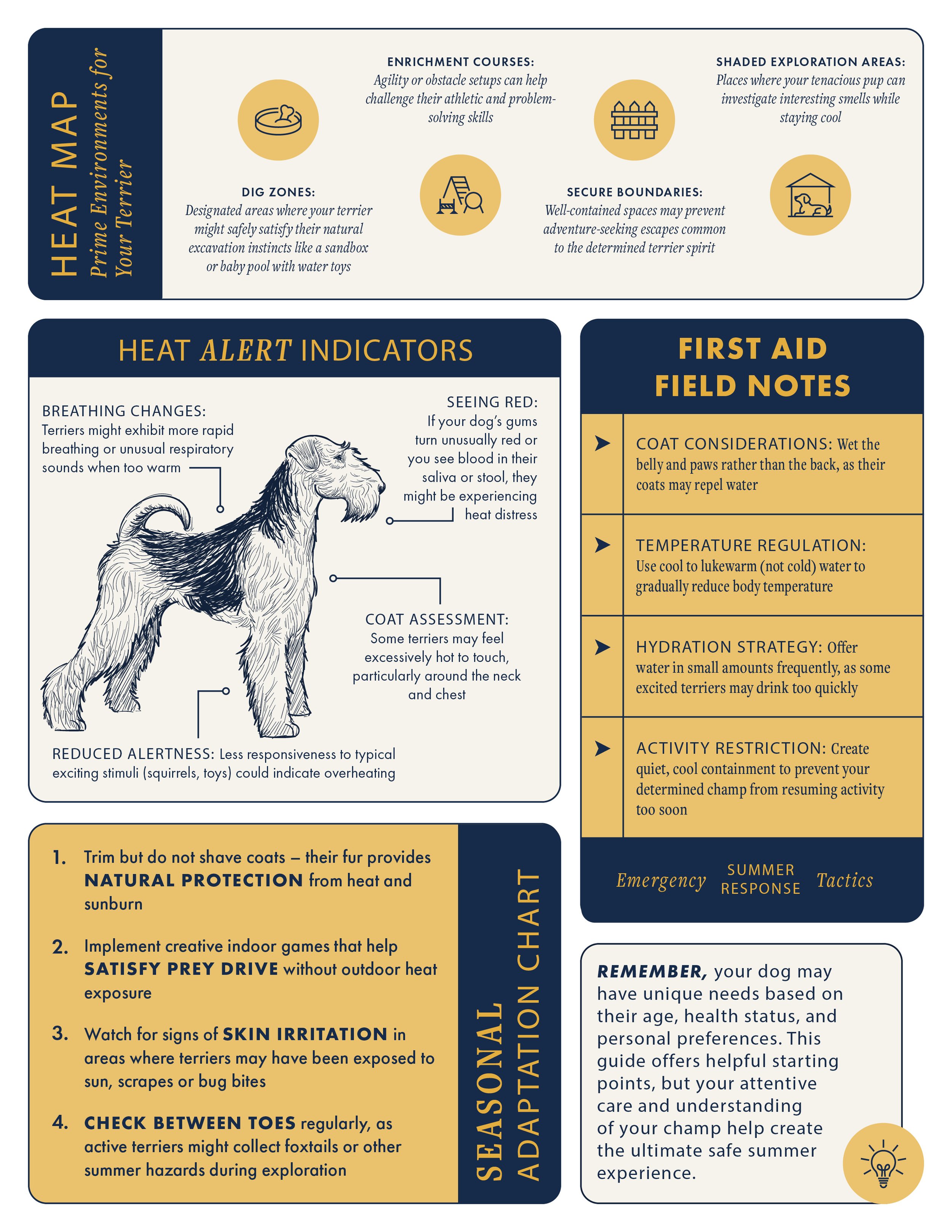
To make safety engaging, we created The Official Breed Group Survival Guide. Styled like a classic field manual, the guides provided tailored advice and insights for different breed groups. This approach transformed generic safety messaging into a collectible and shareable experienceQ2 AKCPI only.
Each guide featured:
Habitat Map: Activities and environments where the breed thrives
Heat Alert Indicators: Signs of overheating tailored to each breed
First Aid Field Notes: Emergency tips specific to breed tendencies
Seasonal Adaptation Chart: Practical adjustments for year-round care
Ad Design


Icon Library
Crafting Credibility Through Design
Challenging the balance between authority with warmth, I drew inspiration from vintage ration designs that were once created to be both functional and trustworthy. Their structured grids, bold typography, and utilitarian clarity informed the foundation of the handbook system.
To soften and modernize the aesthetic, I incorporated tactile textures, and playful illustration details that kept the tone welcoming and pet-focused. This blend gave the campaign a sense of timeless reliability while still feeling fresh.